Website Lead Generation | Why don’t I get leads from my website?

March 01, 2025 by
Website Lead Generation Not getting any leads from your website? Wondering why that is? In this article, we will go over in checklist fashion some key things that might be holding your website back from turning website visitors into leads. People are not finding what they are looking for Here’s how I think of a […]


Website Lead Generation

Not getting any leads from your website? Wondering why that is? In this article, we will go over in checklist fashion some key things that might be holding your website back from turning website visitors into leads.

People are not finding what they are looking for

Here’s how I think of a website. There is a person who is trying to solve a problem, and they are looking for something. So they go online looking to solve that problem. When they come to your site, they are quickly trying to identify whether or not their problem can be solved by your company. If they can’t find specific mention of their problem, they will often click away to another site.

The website is about you not them

Sticking with this idea that a website is made for a person trying to solve a problem. When this person is searching online, they are very selfish. All they are thinking about is themselves and their problem. They don’t care about you, your company or your reputation. Many businesses make the mistake of making their website about themselves. They mention how many years they have been in business or what services they offer. The hero of the website is them. Instead, the hero of the website should be your customer and their specific wants and needs.

There is no clear next step to take

To turn a visitor into a lead, you have to take that person down a clear path. There has to be a clear next step for them to take. Hopefully, one that will directly lead to solving that person’s problem. The key is to think through the visitor’s need. Find out what they are thinking. And then give them a clear next step that solves their immediate problem.

The website is trying to get them to do more than one thing at a time

As the Confucius saying goes: “Man who chases two rabbits catches none.”

Your website should have one main primary action you want visitors to take and should not confuse the visitor with too many requests. In the book The Paradox of Choice, Barry Schwartz talks about a study that was done where free samples of jam were given out at a grocery store. Four types of jam were available, and 22% of samplers ended up buying a jar of jam. In the second sample, 12 types of jam were available, and only 8% of samplers ended up buying a jar of jam. When too many choices are given, the safest choice becomes doing nothing.

The benefit is not clear to them

There’s an old marketing saying that goes, ‘People don’t want to buy drills. They want to buy quarter inch holes.’

In many ways, your product or service is an obstacle to the thing your visitor wants. They don’t want construction services. What they really want is a new building. They don’t want a financial advisor they want to sleep easy at night knowing their money safe.

If people who visit your website aren’t turning into leads, then perhaps the benefit they would receive from you is not clear enough.

You lack a strong, compelling offer

Have you ever run into a friend you haven’t seen in awhile and said something like ‘hey we should hang out sometime’? And what ends up happening? Nothing, right? That’s because saying ‘hey we should hang out sometime’ isn’t a strong, compelling offer.

What if instead when you saw your friend who you haven’t seen in awhile, you said ‘hey I’m glad I ran into you. I have an extra ticket to the Giants game this weekend, do you want to join me?’ Now, this might not always work either. Maybe the other person has plans or doesn’t like baseball. But I bet the closing rate of you hanging out with your friend would be much higher if you gave a strong, compelling offer, rather than a weak and vague one like the ‘let’s hang out sometime’ offer.

Are you making this same type of mistake with your website? Do you have a clear, strong, benefit driven offer on your site? I can tell you from experience how powerful it is to have one.

Back in the day, we used to offer a ‘Free Quote’ for your website project. But guess what? Everyone offers that. And if everyone is offering the same thing, then it’s not much of an offer.

As soon as I came up with the ‘Free Custom Mockup’ offer our business doubled overnight.

The visitor doesn’t trust you

Maybe you do have a compelling offer, but you still aren’t getting leads from your website. What gives? It might be that visitors don’t trust you. Perhaps the offer is too good to be true, and they think it’s a scam. Or maybe your website doesn’t seem professional or authoritative enough to lend credibility to your offer. Poor design causes mistrust in visitors. Having a professionally designed website can instantly make your business, and your offer seems more credible and increases visitor conversions into leads.

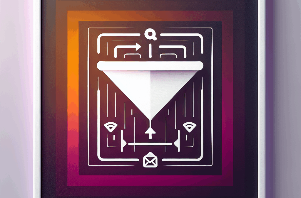
You don’t have a secondary offer (not ready to buy right now)

Of all the visitors coming to your website about only 20% of them are ready to make a buying decision right now. That leaves 80% of visitors who will not be responsive to your primary offer, which is usually a call to take action now. So, what to do? This is when it pays to have a secondary offer. You’ve probably seen these all over the place. Have you ever signed up for an email newsletter? Or given your email to receive a free white paper or pdf download? Those are all secondary offers. The idea is you give something of value to visitors who are still in ‘information gathering’ mode in exchange for a way to stay in touch with them and nurture that relationship over time.

‘Wait a minute!’ you say. What about the paragraph above where you said that one of the mistakes is to ask a visitor to do more than one thing at a time? Yup. You got me. It is a contradiction. That’s how it is sometimes with marketing. There are competing interests, and they don’t always mesh perfectly together.

The trick I’ve found is to make the primary offer primary. Meaning, make it the first offer that the visitor sees and the most compelling one. And make the secondary offer less prominent, typically towards the footer of your site so that the visitor sees it. But not so prominent that it takes away from your main offer.

The visitor doesn’t understand the process

As P.T. Barnum once said: “No one ever went broke underestimating the intelligence of the American people.”

Not that people are stupid. They’re just busy.

Because of this, you want to layout the process of what it is you do as simply and specifically as possible.

You know how when you go to visit a doctor they talk you through everything they are about to do and then reiterate each step as they’re going through the procedure? This is meant to reassure the patient and make the process as stress-free as possible.

That’s what you want to do with your website. You want to lay out exactly what the process is. What’s the first step and the second step, etc.. Never leave your visitor in doubt. As Patrick Swayze says in the excellent movie Point Break: “Fear causes hesitation. Hesitation causes your greatest fears to come true.”

Conclusion

So there you have it. If your website isn’t bringing you leads, run through the checklist and see if you can improve in any of these areas. And if you’re looking to hire a professional to help you with your website project, please contact us. We don’t just design pretty looking websites; we build websites that convert visitors into leads which generate new business for our clients.

Conversions

Your Dream Website Is Just One Click Away

At Ericks Webs Design, we believe every business deserves a stunning online presence — without the stress. We offer flexible payment options, a friendly team that truly cares, and expert support every step of the way.

Whether you’re a small business owner, a church, or a growing brand, we’re here to bring your vision to life.

✨ Let’s build something amazing together.

— no pressure, just possibilities.

Latest News & Website Design Tips

Stay up-to-date with the latest insights, trends, and tips in business website design. Explore our newest articles to discover strategies that can help you elevate your online presence and grow your business.

Why Your Website is Your #1 Sales Tool in 2025

Why Your Website is Your #1 Sales Tool in 2025

The article “Why Your Website is Your #1 Sales Tool in 2025” highlights the importance of having an effective website as the key to driving sales for small businesses. It emphasizes that a well-designed website acts as a digital storefront, attracting customers with engaging content rather than clutter. With studies showing that consumers prefer informative articles over advertisements, businesses should focus on solid branding, SEO, and mobile-friendliness. Regular updates and maintenance are crucial to keep the site relevant. Ultimately, the article stresses that your website is your number one sales tool in 2025, urging small businesses to invest attention and care in their online presence.

Track & Improve Conversions with These Tools

Track & Improve Conversions with These Tools

The article “Track & Improve Conversions with These Tools” emphasizes the importance of transitioning casual website visitors into loyal customers for small and medium businesses in South Texas. It discusses leveraging tools like Google Analytics to understand audience behavior, A/B testing to optimize calls-to-action, and Hotjar to enhance user engagement. The article also highlights the role of social proof through testimonials and the significance of defining a unique selling proposition (USP) to stand out in a competitive market. With the right strategies and tools, businesses can effectively track and improve conversions, ensuring a successful online presence.

Capture More Leads with Popups (Without Being Annoying)

Capture More Leads with Popups (Without Being Annoying)

The article “Capture More Leads with Popups (Without Being Annoying)” explains how business owners can effectively use popups to attract leads while maintaining a positive user experience. Rather than appearing immediately, popups should be timed to appear after visitors engage with the site. Clear, friendly messaging and relevant offers tailored to site content are essential. Incentives, such as discounts, can encourage email sign-ups by fostering relationships. Testing various popup styles and ensuring they reflect the brand’s personality can enhance user connection. Ultimately, when used thoughtfully, popups can be a powerful tool for capturing more leads without being intrusive.

How to Use Social Proof to Drive Sales

How to Use Social Proof to Drive Sales

The article “How to Use Social Proof to Drive Sales” emphasizes leveraging social proof to enhance online presence and drive sales for local businesses. It highlights the importance of customer reviews, encouraging satisfied clients to share their experiences on platforms like Google and Facebook. Utilizing social media to showcase success stories and engaging with the audience is also recommended. Creating detailed case studies can provide evidence of results, while showcasing accolades and community involvement builds trust. Overall, businesses can harness social proof to strengthen relationships, establish credibility, and ultimately boost sales in a competitive digital landscape.

5 Website CTAs That Work Every Time

5 Website CTAs That Work Every Time

The article “5 Website CTAs That Work Every Time” emphasizes the importance of effective Call to Actions (CTAs) for improving website engagement. It highlights five key CTAs: “Get Your Free Quote Today!” encourages initial interaction; “Subscribe for Exclusive Tips & Tricks!” builds an email list while providing value; “Let’s Chat!” makes reaching out easy; “Check Out Our Portfolio” showcases previous work to build trust; and “Join Our Community” fosters a sense of belonging. The piece underscores that well-crafted CTAs transform a passive website into an engaging platform, ultimately boosting customer interaction and loyalty.

The Psychology Behind High-Converting Website Design

The Psychology Behind High-Converting Website Design

The article “The Psychology Behind High-Converting Website Design” highlights the importance of an effective website for boosting local businesses. It emphasizes that first impressions are crucial, as users form opinions within 50 milliseconds. Key elements for high-converting website design include visual hierarchy, clean layouts, and color psychology to evoke emotions. Engaging content is essential; it should resonate with the audience, tell stories, and feature clear calls to action. Building trust through easy navigation, social proof, and secure sites is vital for converting visitors into customers. Finally, the website should be adaptive, regularly updated to reflect new information and keep visitors engaged.

Create a Landing Page That Converts Like Crazy

Create a Landing Page That Converts Like Crazy

The article “Create a Landing Page That Converts Like Crazy” emphasizes the importance of an effective landing page for businesses of all sizes. It outlines key strategies to enhance conversions, starting with understanding your audience’s language and preferences. The author recommends using clear headlines, engaging visuals, and strong calls to action. Building trust through social proof, ensuring mobile responsiveness, and optimizing for SEO are also highlighted as crucial elements. Finally, the importance of monitoring analytics for continuous improvement is stressed. The article encourages business owners to collaborate with web design experts to create landing pages that truly convert.

Lead Magnets You Can Add to Your Website Today

Lead Magnets You Can Add to Your Website Today

The article “Lead Magnets You Can Add to Your Website Today” discusses how small business owners can enhance their online presence by using lead magnets. A lead magnet is an incentive, like a freebie, offered in exchange for a visitor’s email address. Suggested lead magnets include e-books, checklists, free trials, discount codes, webinars, and email courses, all designed to attract and engage potential customers. The article emphasizes the importance of making lead magnets easily accessible on your website and using analytics for performance tracking. It encourages businesses to embrace these strategies to convert visitors into lifelong customers, ultimately contributing to their growth.

Why You’re Losing Clients Without a Strong Homepage

Why You’re Losing Clients Without a Strong Homepage

The article “Why You’re Losing Clients Without a Strong Homepage” emphasizes the critical role of a well-designed homepage in attracting and retaining clients. It likens a confusing homepage to a messy store, which can drive potential customers away. A strong homepage should provide clear information about your offerings and resonate with the community, including using local visuals and language options. It’s vital to ensure mobile-friendliness and keep content updated to maintain engagement. A compelling homepage serves as a professional welcome mat for visitors, significantly impacting client retention. In summary, a strong homepage is essential for business success, especially in competitive markets like South Texas.