Creating a Contact Form that Converts

March 19, 2025 by
The ultimate purpose of every website is conversion. Conversions can sometimes be a sale, but in most cases, they occur when you collect a lead. Proper website structure points all your visitors to one place, your contact form. However, that old adage applies. “You can lead a horse to water but you can’t make him drink.” Getting your prospect to […]


The ultimate purpose of every website is conversion. Conversions can sometimes be a sale, but in most cases, they occur when you collect a lead. Proper website structure points all your visitors to one place, your contact form. However, that old adage applies. “You can lead a horse to water but you can’t make him drink.” Getting your prospect to visit your Contact Page is the first hurdle, but then you need them to fill out the form. How can you coax them to do this? Well, based on data and testing, we have put together 10 Tips for Creating a Contact Form that Converts.

Creating a Contact Form that Converts

#1 – Limit the Number of Fields

MecLabs, one of the leading testers of what drives website conversion, discovered that by reducing a form to just four fields, the conversion rate increased by 160% and dropping it to only three increased it by another 17%.

People just don’t have time to fill out complex forms and many are shy about giving you all their information up front. Instead, it works better if you can get them to commit to a micro-yes. Grab that all-important name and email address and then follow-up with emails.

#2 – Reduce the Number of *Required Fields

Think about it… if you mark the phone field as *required, your prospect is going to immediately suspect a telemarketing call. If they had wanted to talk to you on the phone, they probably would have called you themselves rather than fill out your web form.

MecLabs studies have found that by eliminating that *required phone number, conversions increased by 275%.

So, when creating a contact form that converts, make sure you only require the essentials.

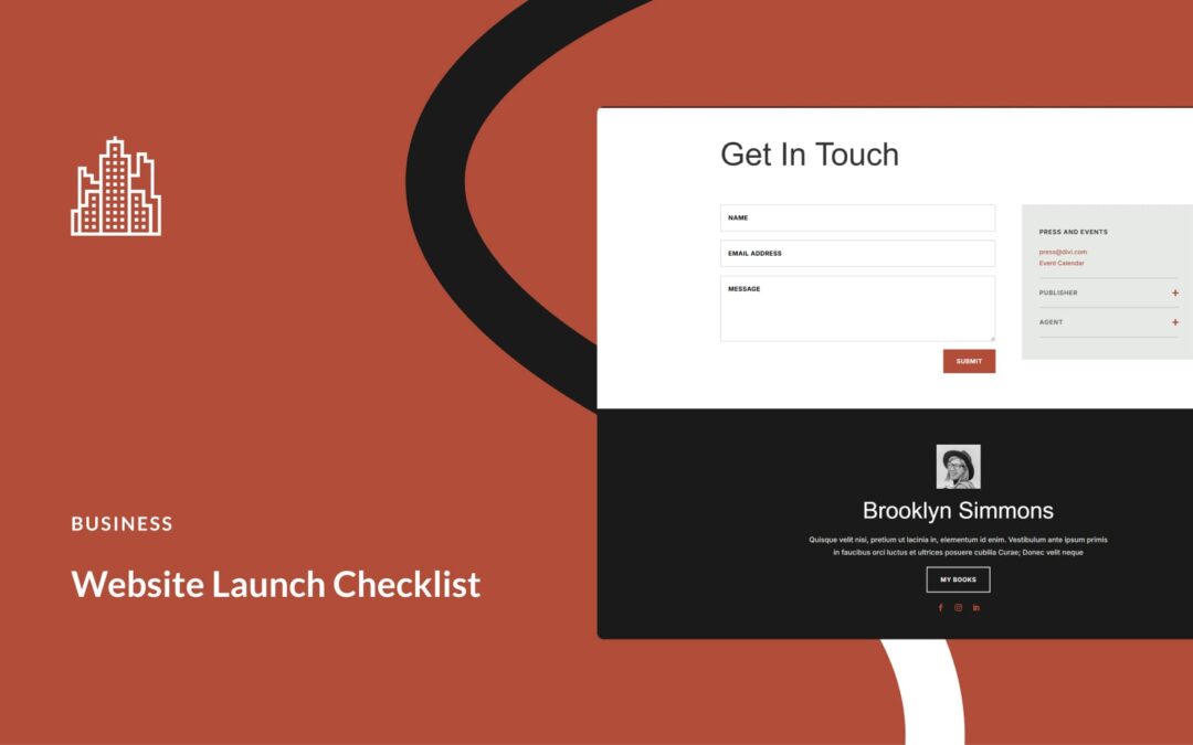
#3 – Position Labels Above the Fields

According to a study conducted by UX Matters:

Placing a label right over its input field permitted users to capture both elements with a single eye movement. Also, if a label indicated data that was very familiar to users—for example, their first name or family name—users did not fixate on the label separately to read it.

People prefer to move up and down rather than in a ‘Z’ formation – left to right. Not only should you place labels above the fields, but when creating a contact form that converts, you should also use one column.

#4 – Clearly Indicate Errors in Submission

Nothing is more frustrating than to fill out a form, hit submit, and get back an error message. Not only do you have to figure out what went wrong, you also have to ‘go back’ which can cause a prospect to abandon your site altogether. Keep them moving forward, not backward in the process.

Use HTML5 or JavaScript to flag a problem as soon as it occurs. Make sure you let them know how to make corrections. For example, if they forget the .com on their email address, flash a message ‘improper email format.’ This makes it easy for them and reduces friction (one of the leading causes prospects quit moving along your funnel).

#5 – Don’t Default to Text Fields

When creating a contact form that coverts, you must use proper data fields. If you want to collect a phone number, then by all means, use the phone number data field. Over half of all searches are made on mobile devices. The field type determines which keyboard (letter or number) pops up on the user’s screen. It is hard to fill in a phone number with letters.

#6 – Use ONE Long-Form Instead of Multiple Forms

There are times when you have to collect larger amounts of information from a client. Suppose you are an insurance company offering free quotes online. You need to collect the requester’s contact information plus what they want to insure, how much insurance they need, and other bits of pertinent information. Three data fields just won’t cut it.

Elastic Path conducted an A/B study of a single-page checkout and one where the forms were shorter but fell on two pages. The resulting conversion was 22% higher on the sing-page form even though it was much longer than the two shorter forms.

The takeaway from this – when creating a contact page that converts, only ask for information you need and put it all in a single page contact form.

#7 – Get Rid of the Captcha

Captcha serves a purpose, but sometimes the negatives outweigh the positives. Instead, you can prevent spambots and increase conversions by placing a hidden field in your contact form. Real users will never see the field and leave it empty. Spambots look at the HTML and see a field that requires data. So, they fill it in. In this case, data entered into the ‘hidden field’ immediately indicates that it was NOT a live person filling out your contact form.

Getting rid of the Captcha reduces that negative friction that prevents conversion that we talked about earlier. In fact, studies show that you can increase conversions by up to 4% when you use the hidden field method instead of Captcha.

#8 – Do Not Make a Visitor ‘Submit’

What’s in a word? More than you think!

We react to subliminal messaging all the time. That is why advertising is such big business. Whether you believe it or not, that one little word on your button, ‘submit,’ can create negative feelings and reduce conversions. Rather, make your action item more detailed and friendly.

  • Complete Your Registration
  • Request More Information
  • Contact a Representative

Use two or three words instead of one and don’t make the request too long. State clearly what will happen and make it about the visitor, not about you.

#9 – Make Your Primary Form ‘Primary’

It could be that you have more than one form or button on a page. ALWAYS make your primary contact form the one that stands out. If you gather leads with a lead magnet, then make sure it’s not hidden in the footer. If you want people to contact you for a quote, place the button or form in the center of the page. Display it prominently. A good UX Design makes it easy for prospects to convert.

#10 – Follow-Up on Form Submissions

Conversion does NOT occur when they fill out the form. It occurs when they reach the end of your marketing funnel. Creating a contact form that converts requires action on your part. Make sure you are notified as soon as a form is completed. Have a plan in place to follow up on those submissions in a timely manner. Also, let the prospect know that you received their form so that they know there were no errors. This is easily done with autoresponders.

Creating a contact form that converts is essential to the success of any website. If you find that people are not being funneled to your contact form or that they are abandoning without conversion, contact us. Ericks Webs Design will create a Free Mock-Up of a new website design focused on user experience and conversion. See the possibilities without any commitment or risk.


Conversions

Your Dream Website Is Just One Click Away

At Ericks Webs Design, we believe every business deserves a stunning online presence — without the stress. We offer flexible payment options, a friendly team that truly cares, and expert support every step of the way.

Whether you’re a small business owner, a church, or a growing brand, we’re here to bring your vision to life.

✨ Let’s build something amazing together.

— no pressure, just possibilities.

Latest News & Website Design Tips

Stay up-to-date with the latest insights, trends, and tips in business website design. Explore our newest articles to discover strategies that can help you elevate your online presence and grow your business.

Why Your Website is Your #1 Sales Tool in 2025

Why Your Website is Your #1 Sales Tool in 2025

The article “Why Your Website is Your #1 Sales Tool in 2025” highlights the importance of having an effective website as the key to driving sales for small businesses. It emphasizes that a well-designed website acts as a digital storefront, attracting customers with engaging content rather than clutter. With studies showing that consumers prefer informative articles over advertisements, businesses should focus on solid branding, SEO, and mobile-friendliness. Regular updates and maintenance are crucial to keep the site relevant. Ultimately, the article stresses that your website is your number one sales tool in 2025, urging small businesses to invest attention and care in their online presence.

Track & Improve Conversions with These Tools

Track & Improve Conversions with These Tools

The article “Track & Improve Conversions with These Tools” emphasizes the importance of transitioning casual website visitors into loyal customers for small and medium businesses in South Texas. It discusses leveraging tools like Google Analytics to understand audience behavior, A/B testing to optimize calls-to-action, and Hotjar to enhance user engagement. The article also highlights the role of social proof through testimonials and the significance of defining a unique selling proposition (USP) to stand out in a competitive market. With the right strategies and tools, businesses can effectively track and improve conversions, ensuring a successful online presence.

Capture More Leads with Popups (Without Being Annoying)

Capture More Leads with Popups (Without Being Annoying)

The article “Capture More Leads with Popups (Without Being Annoying)” explains how business owners can effectively use popups to attract leads while maintaining a positive user experience. Rather than appearing immediately, popups should be timed to appear after visitors engage with the site. Clear, friendly messaging and relevant offers tailored to site content are essential. Incentives, such as discounts, can encourage email sign-ups by fostering relationships. Testing various popup styles and ensuring they reflect the brand’s personality can enhance user connection. Ultimately, when used thoughtfully, popups can be a powerful tool for capturing more leads without being intrusive.

How to Use Social Proof to Drive Sales

How to Use Social Proof to Drive Sales

The article “How to Use Social Proof to Drive Sales” emphasizes leveraging social proof to enhance online presence and drive sales for local businesses. It highlights the importance of customer reviews, encouraging satisfied clients to share their experiences on platforms like Google and Facebook. Utilizing social media to showcase success stories and engaging with the audience is also recommended. Creating detailed case studies can provide evidence of results, while showcasing accolades and community involvement builds trust. Overall, businesses can harness social proof to strengthen relationships, establish credibility, and ultimately boost sales in a competitive digital landscape.

5 Website CTAs That Work Every Time

5 Website CTAs That Work Every Time

The article “5 Website CTAs That Work Every Time” emphasizes the importance of effective Call to Actions (CTAs) for improving website engagement. It highlights five key CTAs: “Get Your Free Quote Today!” encourages initial interaction; “Subscribe for Exclusive Tips & Tricks!” builds an email list while providing value; “Let’s Chat!” makes reaching out easy; “Check Out Our Portfolio” showcases previous work to build trust; and “Join Our Community” fosters a sense of belonging. The piece underscores that well-crafted CTAs transform a passive website into an engaging platform, ultimately boosting customer interaction and loyalty.

The Psychology Behind High-Converting Website Design

The Psychology Behind High-Converting Website Design

The article “The Psychology Behind High-Converting Website Design” highlights the importance of an effective website for boosting local businesses. It emphasizes that first impressions are crucial, as users form opinions within 50 milliseconds. Key elements for high-converting website design include visual hierarchy, clean layouts, and color psychology to evoke emotions. Engaging content is essential; it should resonate with the audience, tell stories, and feature clear calls to action. Building trust through easy navigation, social proof, and secure sites is vital for converting visitors into customers. Finally, the website should be adaptive, regularly updated to reflect new information and keep visitors engaged.

Create a Landing Page That Converts Like Crazy

Create a Landing Page That Converts Like Crazy

The article “Create a Landing Page That Converts Like Crazy” emphasizes the importance of an effective landing page for businesses of all sizes. It outlines key strategies to enhance conversions, starting with understanding your audience’s language and preferences. The author recommends using clear headlines, engaging visuals, and strong calls to action. Building trust through social proof, ensuring mobile responsiveness, and optimizing for SEO are also highlighted as crucial elements. Finally, the importance of monitoring analytics for continuous improvement is stressed. The article encourages business owners to collaborate with web design experts to create landing pages that truly convert.

Lead Magnets You Can Add to Your Website Today

Lead Magnets You Can Add to Your Website Today

The article “Lead Magnets You Can Add to Your Website Today” discusses how small business owners can enhance their online presence by using lead magnets. A lead magnet is an incentive, like a freebie, offered in exchange for a visitor’s email address. Suggested lead magnets include e-books, checklists, free trials, discount codes, webinars, and email courses, all designed to attract and engage potential customers. The article emphasizes the importance of making lead magnets easily accessible on your website and using analytics for performance tracking. It encourages businesses to embrace these strategies to convert visitors into lifelong customers, ultimately contributing to their growth.

Why You’re Losing Clients Without a Strong Homepage

Why You’re Losing Clients Without a Strong Homepage

The article “Why You’re Losing Clients Without a Strong Homepage” emphasizes the critical role of a well-designed homepage in attracting and retaining clients. It likens a confusing homepage to a messy store, which can drive potential customers away. A strong homepage should provide clear information about your offerings and resonate with the community, including using local visuals and language options. It’s vital to ensure mobile-friendliness and keep content updated to maintain engagement. A compelling homepage serves as a professional welcome mat for visitors, significantly impacting client retention. In summary, a strong homepage is essential for business success, especially in competitive markets like South Texas.